

8 facade and shutters colour combinations that will take you on a journey to the south !
When it comes to choosing colours, the one you select for your home's façade is particularly important. Renovating a façade is both time-consuming and costly, so it's worth taking the time to make the right decision from the start. Choosing the colour of your shutters and joinery is just as essential. Should you stick with grey or off-white for a sleek, contemporary look ? Or dare to introduce colour and bring warmth and personality to your exterior ? And, for that matter... are you actually free to choose any colour you like ? Let's explore eight inspiring colour combinations for façades and shutters, along with our best tips and advice to help you make the right choice !
1- Ochre tones : a journey to the heart of the Luberon
As proud locals, how could we begin this article with anything other than the colours of our beloved Luberon ? Visitors from all over the world marvel at the yellow, orange, and red façades that give our villages their unique character, with Roussillon undoubtedly leading the way. Although ochre has no longer been extracted in Roussillon since the 1950s -and yes, we'll take this opportunity to remind you that it is actually extracted from our quarry just a few kilometres away, in the commune of Gargas- it remains one of the most iconic symbols of the region. Ochre seems to be everywhere, and the colourful façades of the villages stand as a testament to this living heritage. A small but important clarification : the bright, vibrant reds often seen on limewashed façades are not necessarily produced using red ochre. Because lime is a white binder, mixing red ochre into lime generally results in a pink shade rather than a vivid red. The brightest reds are therefore often obtained using synthetic pigments, which offer stronger colouring power, although they are generally less UV-resistant than natural pigments. As a result, many brightly coloured façades are commonly referred to as "ochre façades", even when no ochre has actually been used. It is important to distinguish between a colour and the material.
With yellow, orange, and red façades, you'll be spoiled for choice: blue shutters, olive green shutters, grey-green shutters, and one timeless feature to make everything stand out beautifully — white trim.
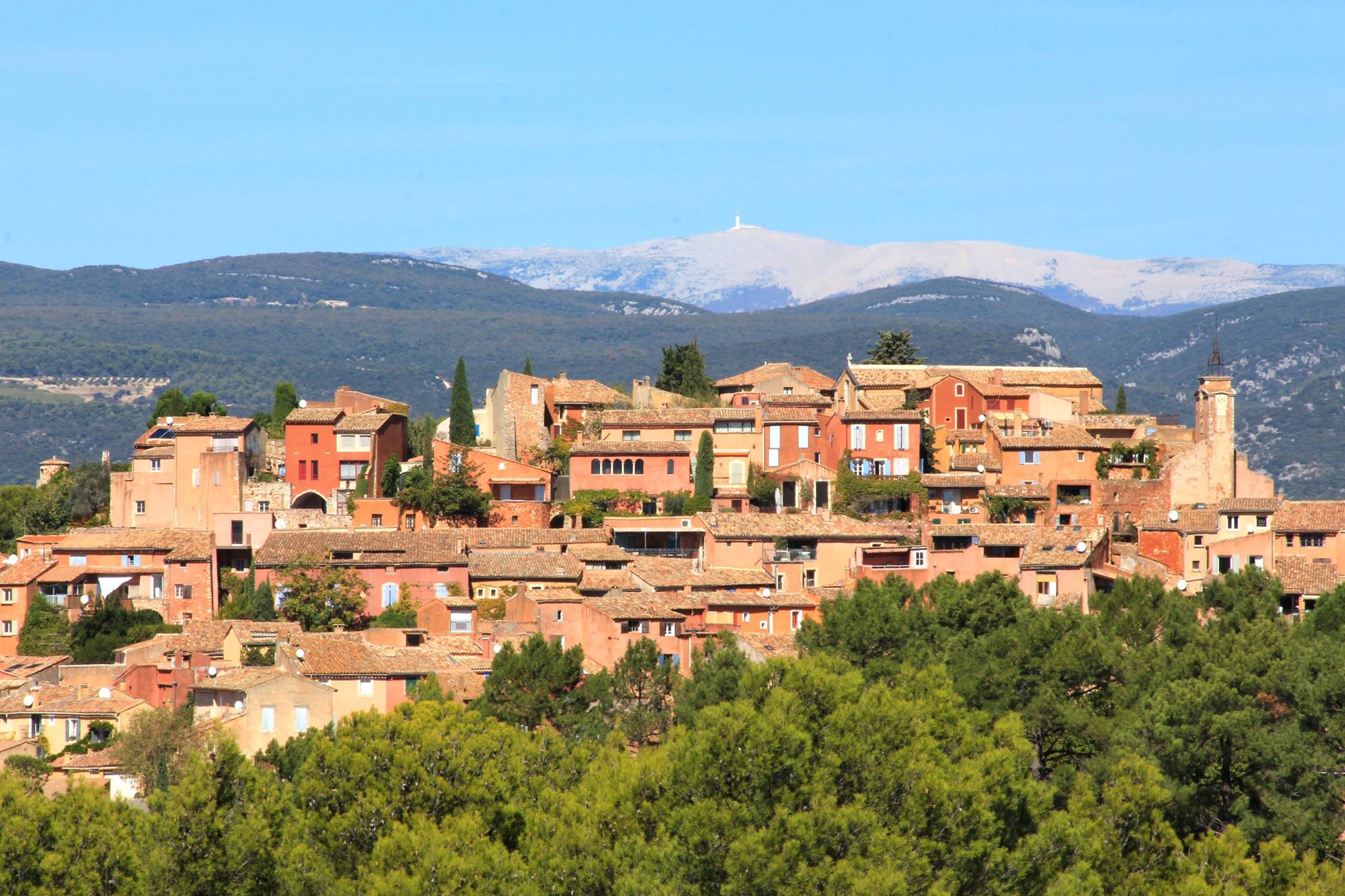
Village of Roussillon. Photo credit : Pays d'Apt Luberon Tourism Office.
2- Stone façade and lavender blue : the charm of tradition
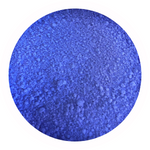
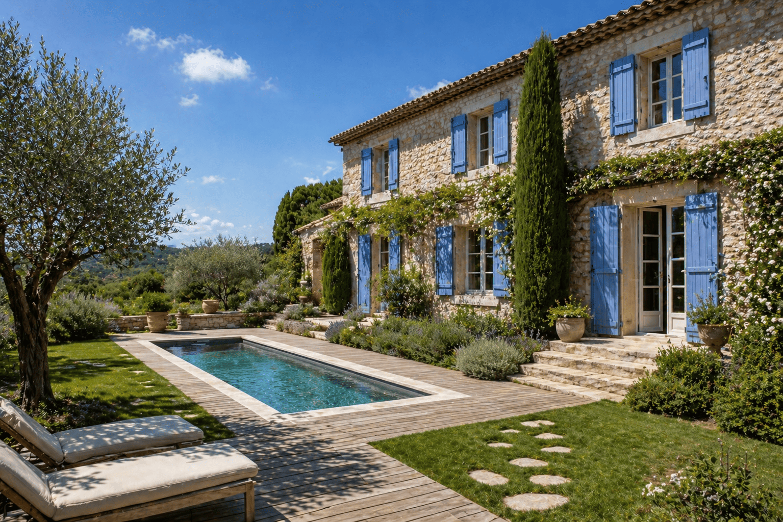
Just a few kilometres from Roussillon lies the village of Gordes, offering a completely different atmosphere. Here, colourful façades give way to another equally striking and magnificent feature : dry stone architecture. The façades are built entirely from local stone, creating a remarkable sense of harmony throughout the village. With this typically Provençal style of construction, we particularly love the combination of natural stone and lavender blue, another great source of local pride. Somewhere between blue and violet, this shade beautifully enhances the raw beauty and character of the stone. Once your wooden shutters have been properly sanded back to bare wood, why not choose a lavender blue flour paint ? While synthetic pigments are generally not recommended for traditional Swedish paint, lavender blue has consistently demonstrated excellent UV resistance over time. For this reason, it is the blue shade we most confidently recommend for exterior applications.
AI-assisted rendering
3- Cream-coloured render and green shutters : a Provençal classic
Whether it's grey-green, sage green, or olive green, we love this soft and soothing combination. For both renovations and new builds, smooth trowelled or scraped renders are now generally preferred over more rustic or crushed finishes. A beige or cream-coloured render provides an elegant, understated backdrop, while green shutters add that unmistakable touch of Provençal charm. For a beautiful olive green finish, we particularly love Terre Verte de Brentonico (= Brentonico Green Earth) in traditional flour paint.
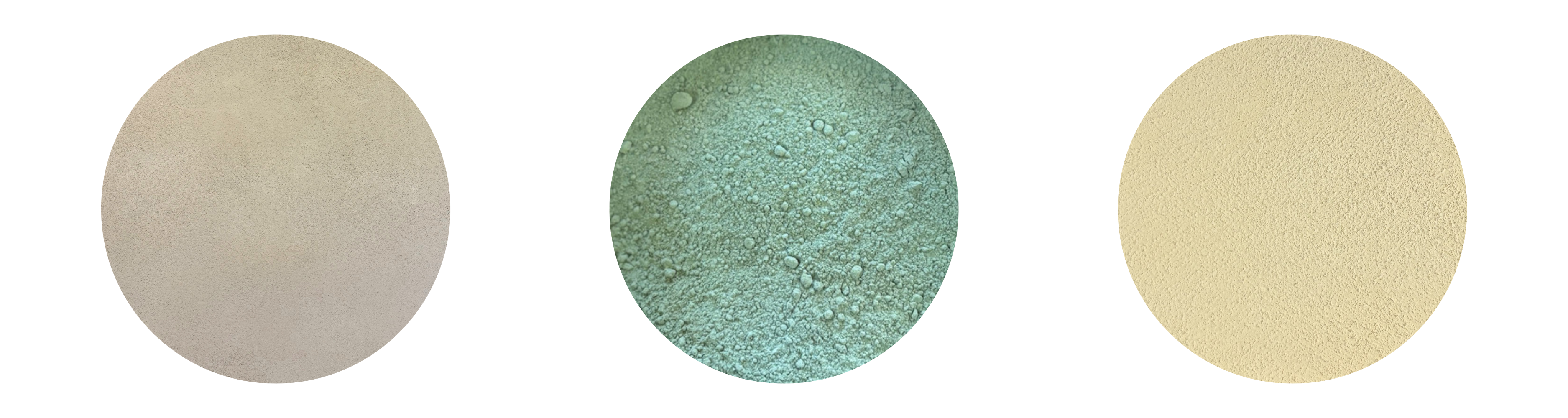
Sofodor Jaune N10 / Pigment in powder Terre verte de Brentonico / Badisof Plus Crème - Ocres de France
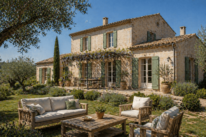
AI-assisted photo rendering
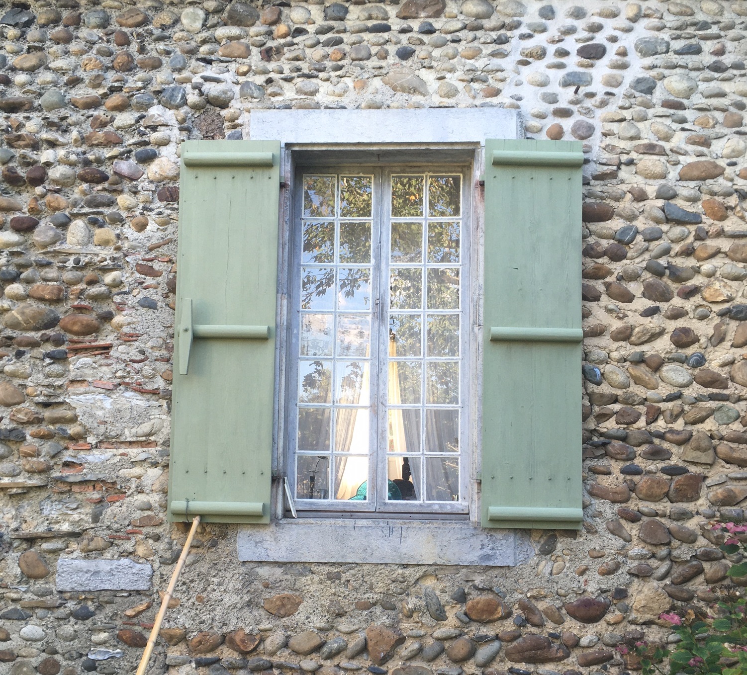
Crédits photo : peinture & photo Isabelle Garrigues (peinture à la farine terre verte de Brentonico + blanc tiona)
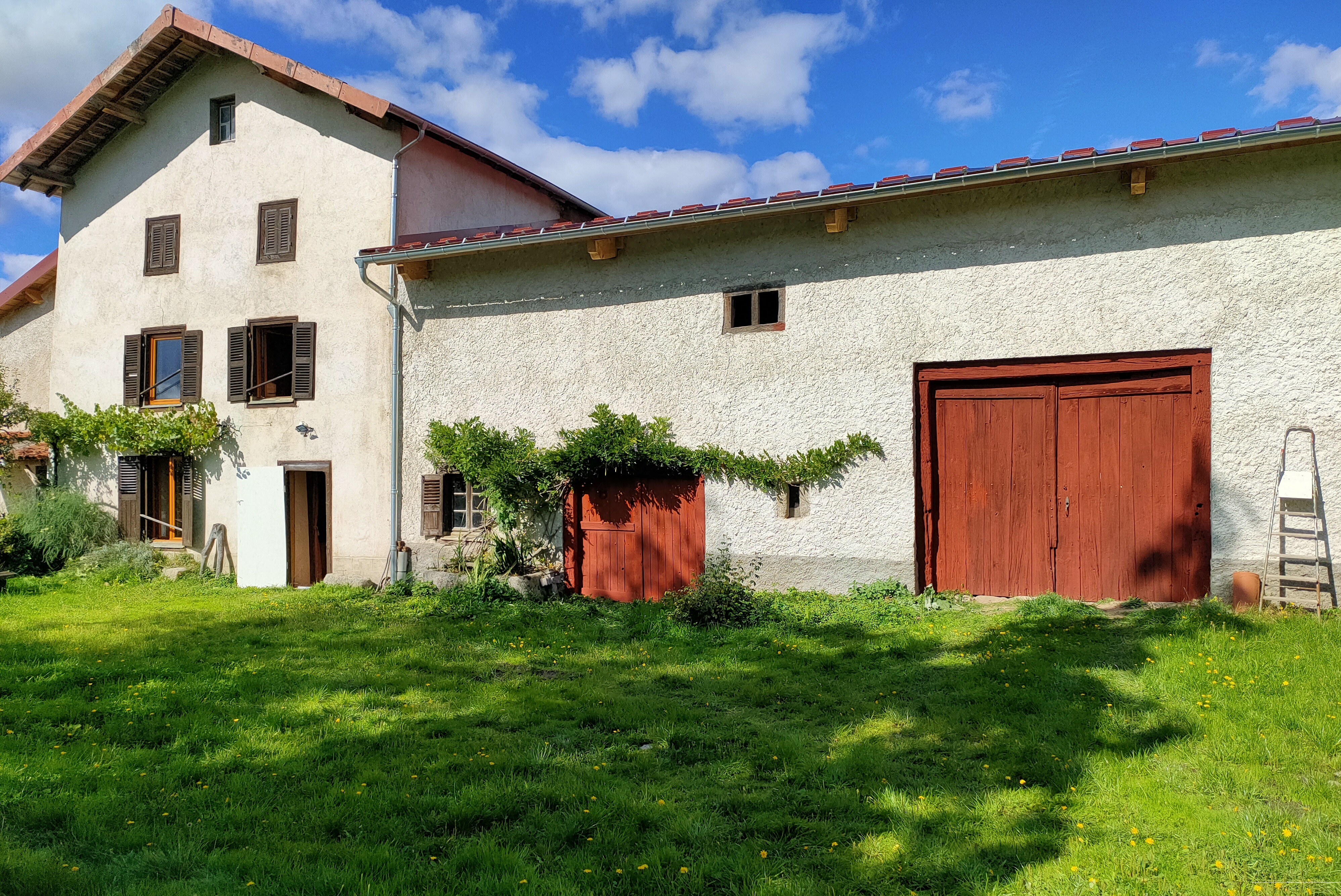
4- White façades and red shutters : a journey to the Pays Basque
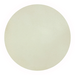
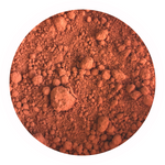
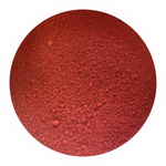
“I'd like to make a flour paint for my shutters and I'm looking for a traditional Basque red, something close to oxblood red”... This is a phrase we have heard approximately 68,796 times at Ocres de France (yes, we counted). Almost as often as “I'm trying to recreate the famous Swedish red”. For a traditional Basque red in flour paint, our ocre rouge RFLES (= RFLES red ochre) is an excellent choice. If you're looking for a shade closer to the historic Falun red (which is no longer produced today), we recommend Rouge vénitien (venetian red), a brighter and more luminous pigment. Paired with a light-coloured render, such as our Lacoste shade, shutters painted with Ocre rouge RFLES instantly evoke the timeless charm of Pays Basque.
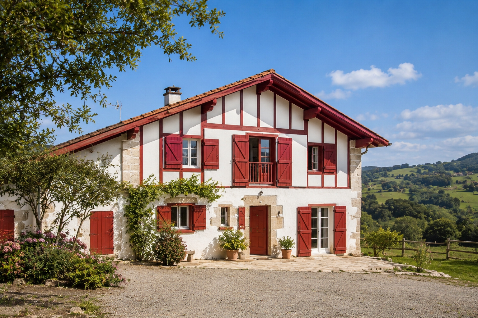
IA-assisted rendering
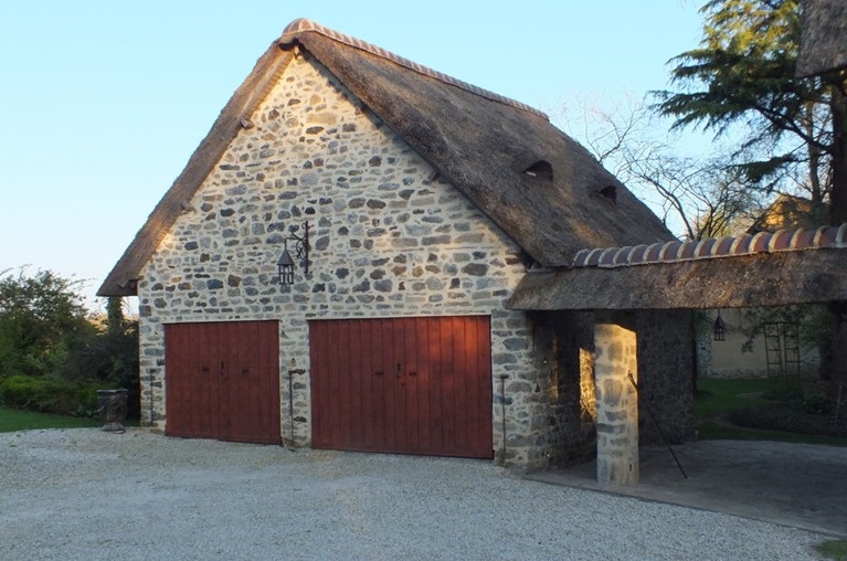
Photo credits : Guy Hedouin, flour paint with ocre rouge RFLES
5- Light façades enhanced by anthracite grey : modern style guaranteed
When choosing light colours for your façade, don't be afraid to create contrast with dark joinery and shutters. Deep shades can beautifully highlight cream, beige, and stone-coloured renders while adding a contemporary touch to the overall look. The reverse is also true : when shutters are particularly dark, it is generally best to avoid overly bold façade colours, as this can make the whole exterior appear too heavy or sombre. One of our favourite combinations is Sofodor Ton Pierre N40 paired with shutters finished in anthracite grey flour paint, either in its pure form or slightly softened with a touch of Blanc tiona.

Pigment in powder Gris anthracite / Sofodor Ton Pierre N40 - Ocres de France
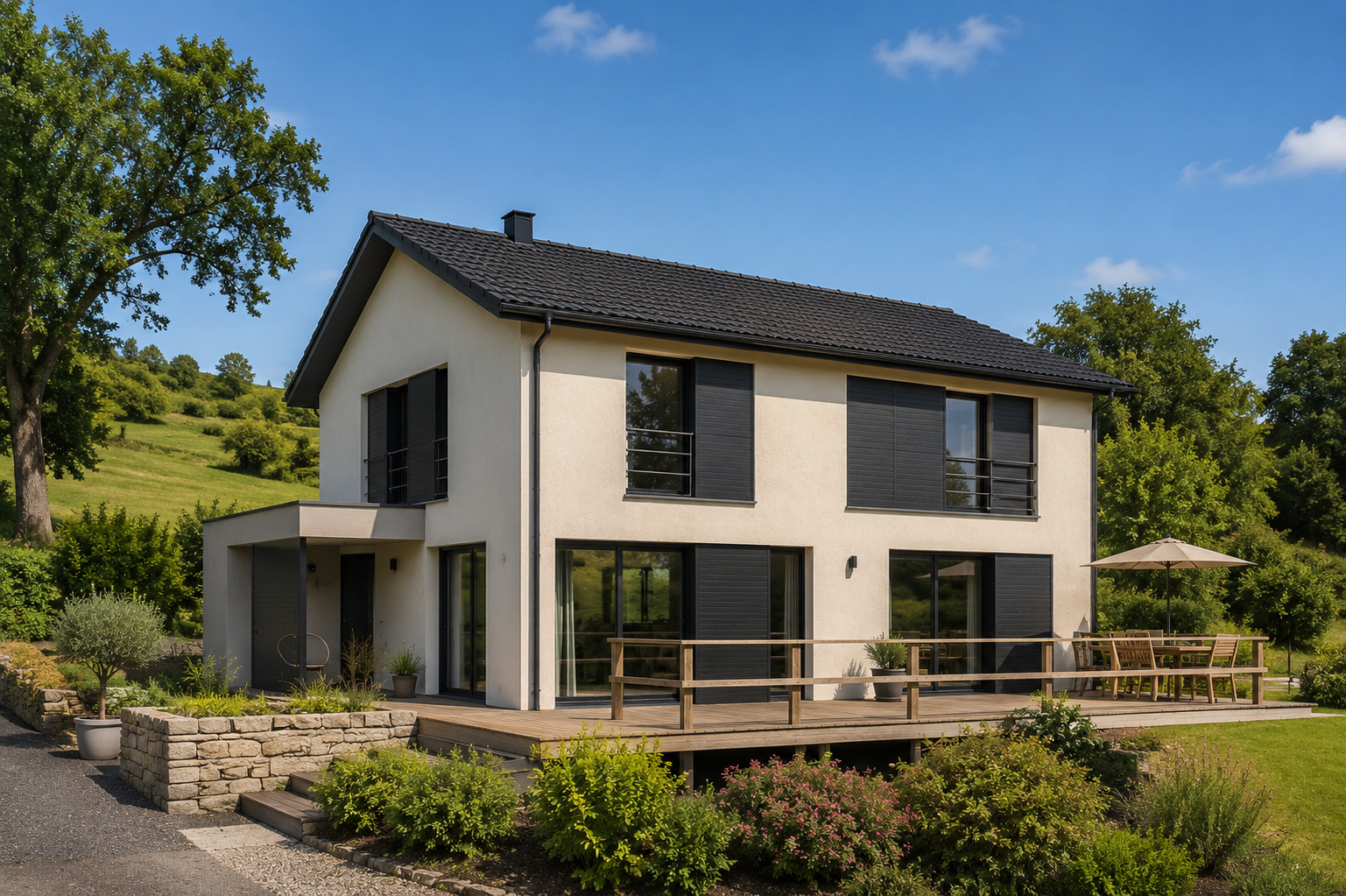
AI-assisted photo rendering
6- White and blue, a taste of Greece
In southern Greece and in the Cyclades, façades are mainly white. Indeed, during the summer months, temperatures are very high and it becomes necessary to protect both people and homes from the sun's rays. As white reflects part of the solar radiation, it is the best ally for reducing the temperature inside houses. Blue, another local characteristic, is said to repel mosquitoes... Whatever the truth may be, the combination of these two colours makes us dream and brings a great deal of warmth to our hearts !

Badisof Plus Mont Blanc / Pigment in powder Bleu outremer - Ocres de France
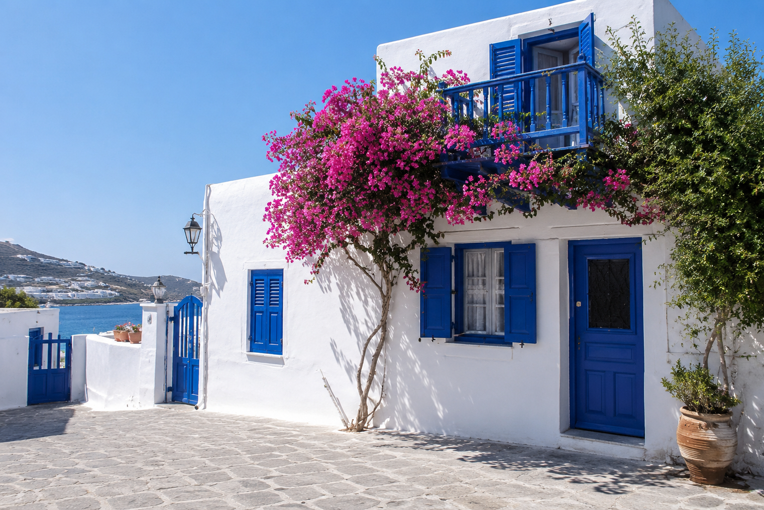
AI-assisted photo rendering
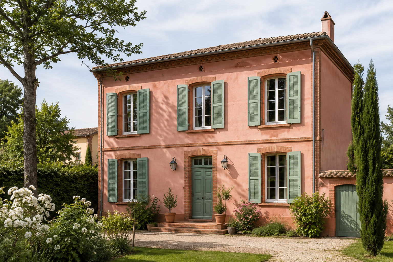
AI-assisted photo rendering
7- Daring pink, between Nice and Toulouse
We see life through rose-coloured glasses and embrace this soft shade on our façades too. Pastel or more vibrant, pink is often misunderstood because it is associated with façades that were once red and have faded over time. Yet the salmon-pink colour of the city of Toulouse wins many hearts ! For a colour similar to that of Toulouse's brick buildings, we have put together a small selection of renders and limewashes. And for those who prefer to create their own mixes, consider our wonderful Ocre rouge RFLES (red ochre RFLES) to colour your own lime-based creations. Pink pairs beautifully with green, whether it leans towards olive green, sage green, or grey-green.
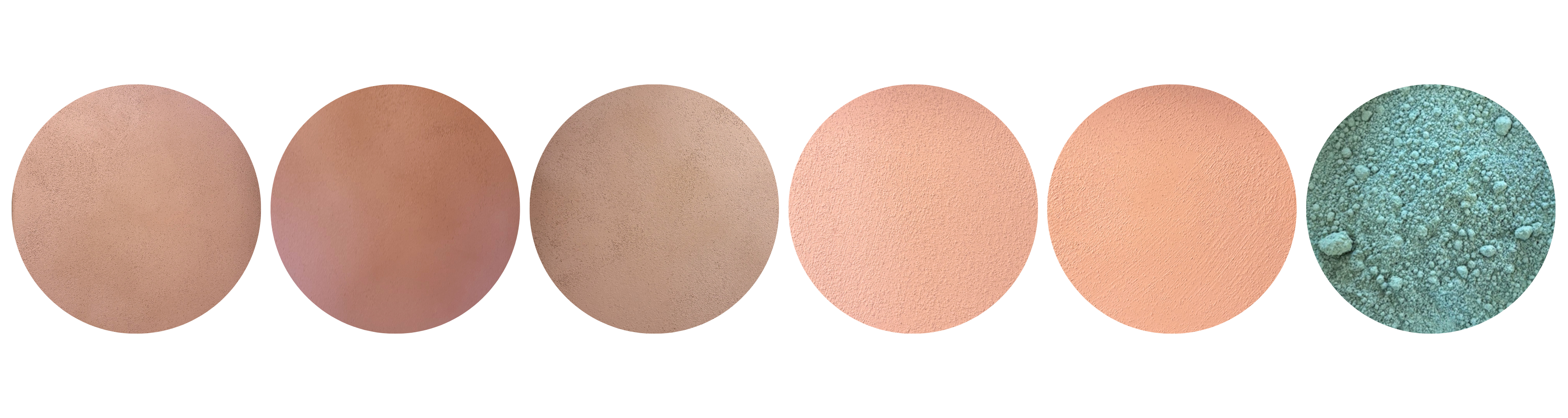
Sofolith Saignon / Sofolith Gignac / Sofolith Ventoux / Badisof Plus Mélina / Badisof Plus Pétale de rose / Pigment en poudre Terre verte de Nicosie - Ocres de France
8- Red and lavender blue : it feels like the south
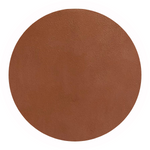
Typically Provençal, this red and lavender blue combination instantly brings to mind the sound of cicadas on a warm summer day. The contrast is both vibrant and harmonious. The warmth of the red façade pairs beautifully with the softness of the lavender blue shutters, creating an exterior full of character without feeling overwhelming. This combination works equally well on a traditional farmhouse, a village house, or a more contemporary home looking for a touch of Provençal charm.
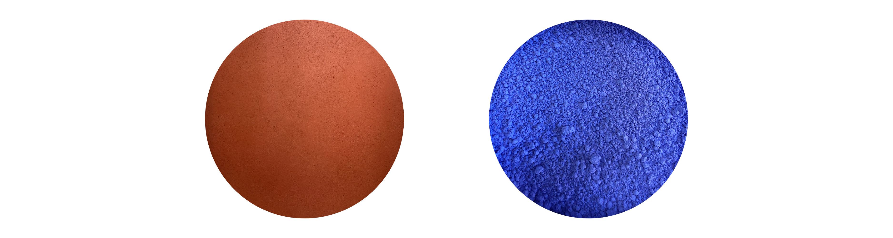
Sofodor S40 / Pigment in powder Bleu lavande - Ocres de France
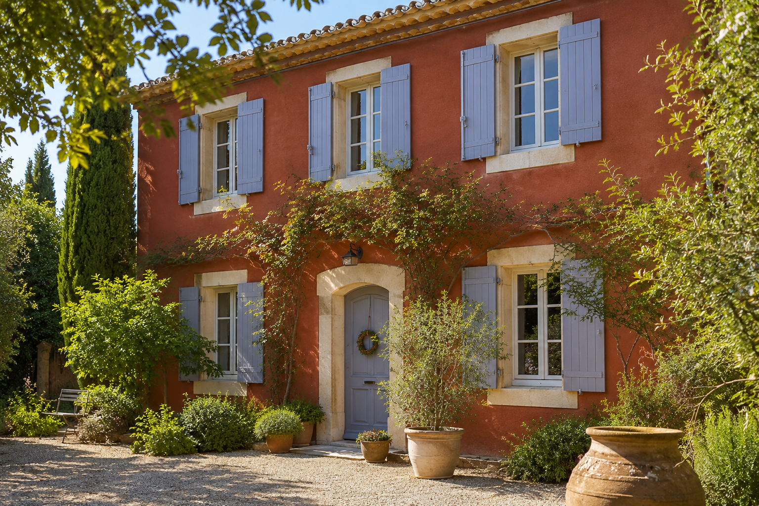
Visuel généré par IA
To conclude, keep in mind that there is no universal rule for matching the colour of a façade with that of its shutters. Everything depends on your home's architecture, its surroundings, and the atmosphere you wish to create. Soft, natural shades stand the test of time with elegance, while bolder contrasts bring character and a real sense of personality to your home.
A few points to keep in mind :
* The most important thing is to find a balance between colours, materials, constraints, and the light conditions specific to your region.
* Consider carrying out a few tests, particularly by ordering samples : a colour never reveals its full potential until it is seen in a real-life setting and under natural light.
* Not all façade and shutter colour combinations will necessarily be accepted by your local planning department. Be sure to check local planning regulations before deciding on a colour scheme.