8 colors to (dare) adopt in 2022
If you thought you were enjoying the benefits of outdoor time enought, know that it is not the same for everyone : according to a survey conducted by YouGov, we would spend 90% of our days indoors ! If we do not always have the time to decorate our workspace to our liking, we mostly want to create a space that pleases us and resembles us in our home. Thus, 26% of French declare that they repaint their walls "very regularly". But faced with the infinite range of possible shades, often the neutrality of white reassures and sweeps away the desire for colors. For fear of getting tired, of creating a contrast with our usual style, of leaving our comfort zone… and for fear of mismatching the shades between them. What if in 2022 we dared ? It’s time to introduce you to 8 popular colours this year and how to match them to perfection !
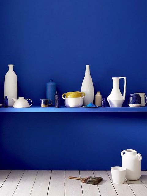
1- The Peacock blue
Colors are above all a question of subjectivity, we know the problem very well within the Ocres de France team : we don’t have quite the same definition of colors ! “But peacock blue… it must be a little closer to the green collar*, no?” … said the production team. So yes, it can be a green tinged with blue or a blue tinged with green, more or less dark, each one goes to his vision of the thing. We chose in 2021 to create a peacock blue lime paint -soon available, we hurry up, promise ! - to meet the demand for this colour, which has become increasingly popular for several years. For a bright and soothing interior, you can pair it with white. It will bring the necessary color touch to embellish a living room, modern kitchen or bedroom ; and will give depth to your room. We love it in a Scandinavian atmosphere, graphic as well as retro-chic or cosy. To give it a more dynamic side, we suggest you to combine it with our popular second colour, the...
* In French, for peacock blue, we say "bleu canard" ("duck blue")
AI-assisted photo renderings. Pigment Bleu Canard Ocres de France / Lime paint Badisof Plus Bleu Lagon (smoothed)
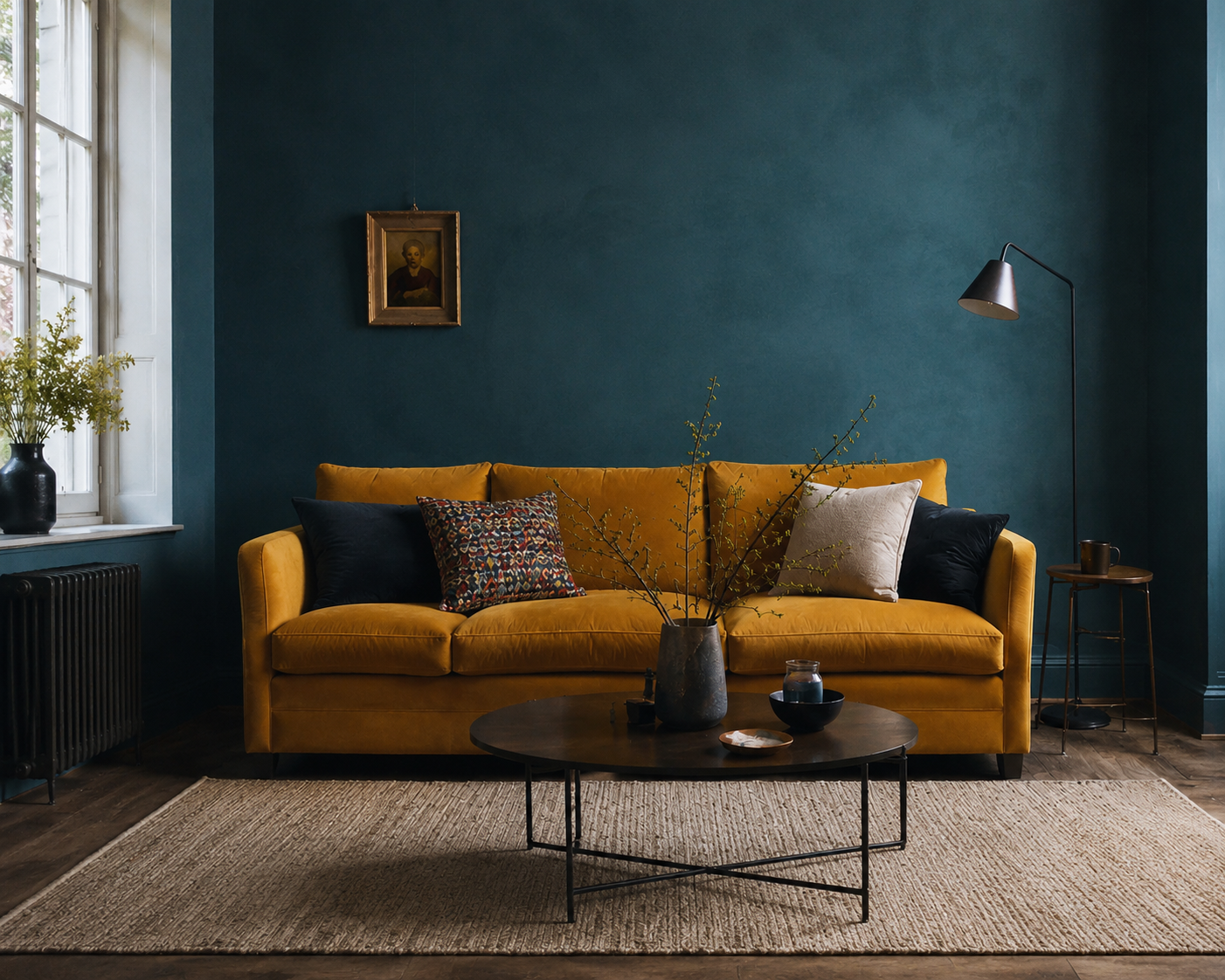
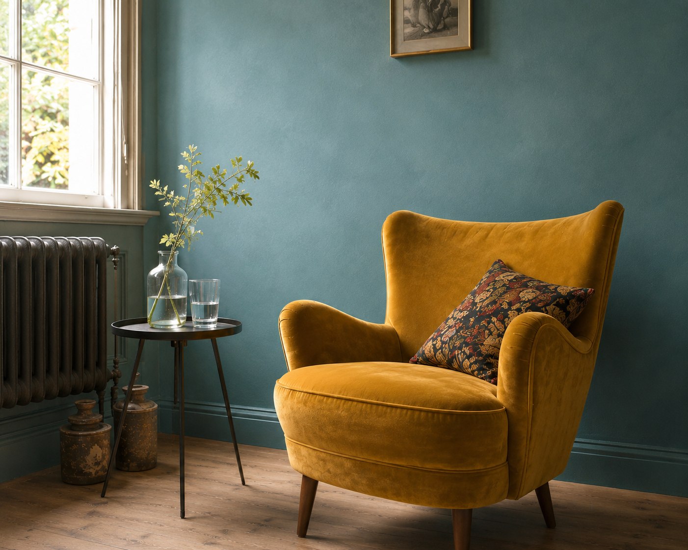
2- ... Mustard yellow !
Indeed, yellow is the striking ally of blue. And we must admit it : we completely fall on this lively alliance. Of course, as always in decoration, it will be a matter of dosing the proportions to create a dynamic environment without being overloaded. We immediately think of Scandinavian interiors with this association that may seem daring but works perfectly, both in a nice living room in solid parquet floor and in a refined kitchen. In a more industrial interior, Yellow Mustard may be associated with grey or black. Finally, white will bring sobriety. In a rather contemporary and refined setting, it will bring the touch of pep’s necessary to brighten up your room. In another register of blue, more exotic, why not try to tune it with the...
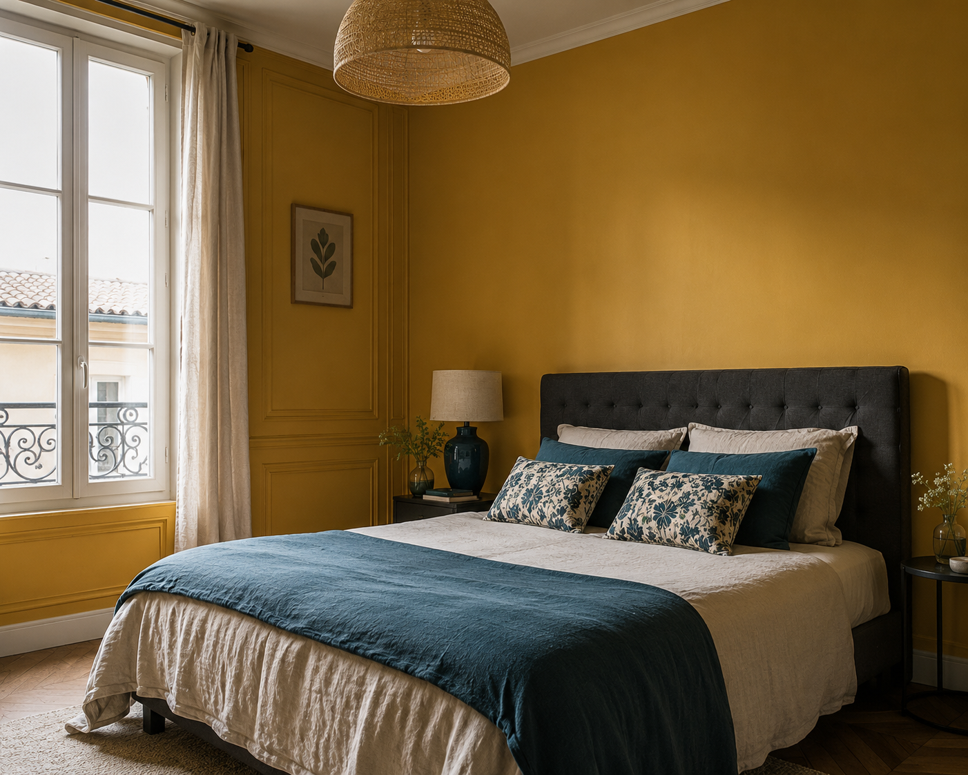
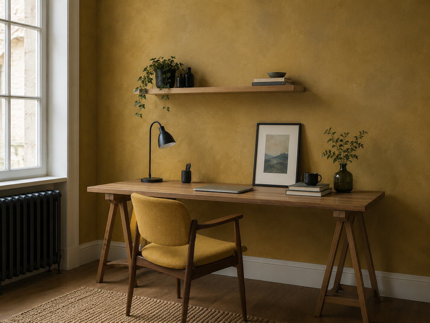
AI-assisted photo renderings. Pigment yellow Mustard to come / Yellow Mustard limewash to come
.JPG)
3- ... Ultramarine blue ! (Klein blue/Majorelle blue)
Timeless, the Bleu Outremer makes the hearts of those who dream of exoticism capsize. We like it both outdoors on shutters, a door, and indoors in a bathroom inspired Hammam. Bright and deep, its shades vary depending on the day to create different atmospheres. With yellow, a ethnic chic or bohemian decoration is created. White, meanwhile, will bring out its character on a wall. For an inspiration straight out of Morocco, dare to associate it with the...
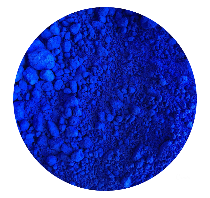
Photo 1 : Bleu Outremer in acrylic binder, work done by Pascal Peinture Déco with our pigment. Photo 2 : AI-assisted photo renderings.
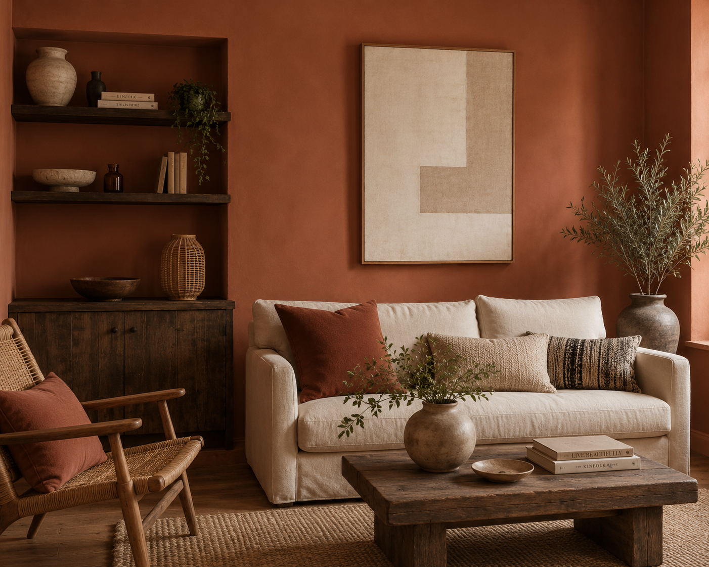
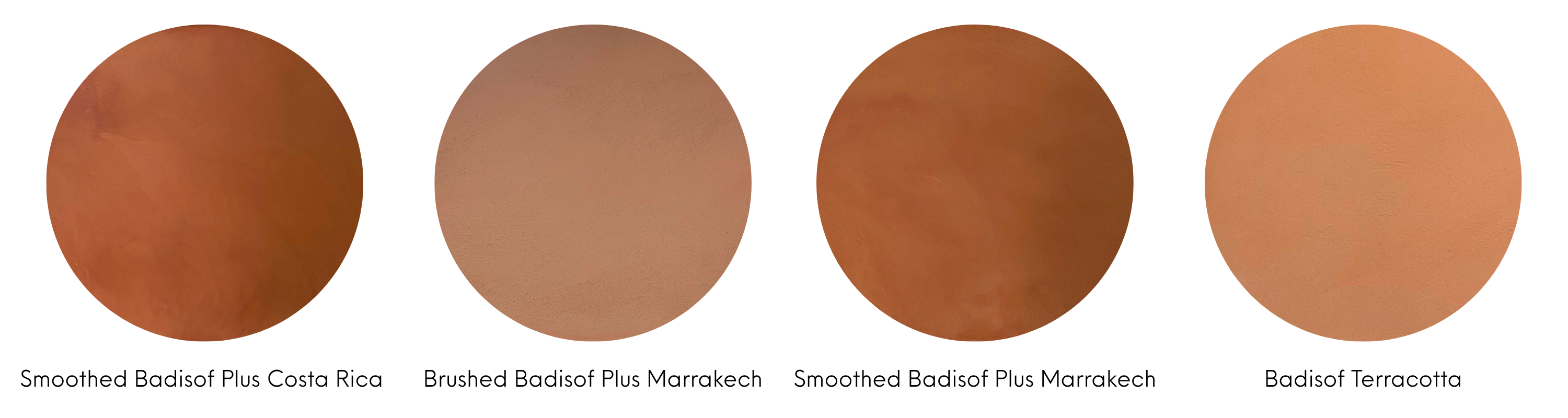
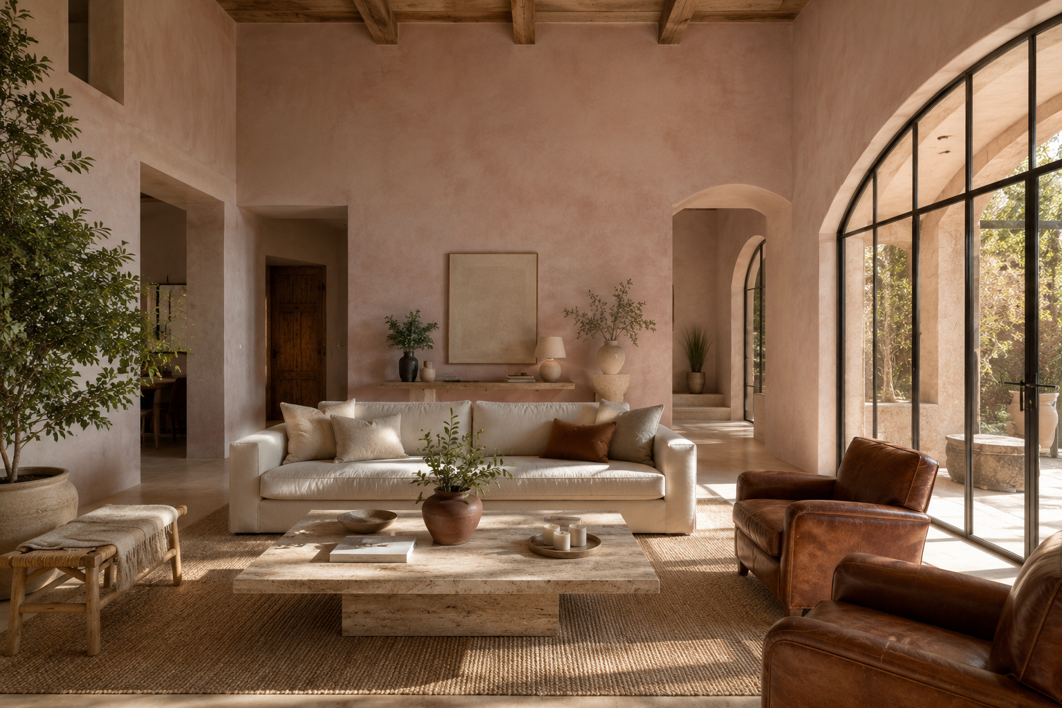
4- ... Terracotta !
Another colour that is difficult to define… “Terracotta” comes from Italian. Unsurprisingly, it represents a wide palette of shades. It can pull towards red, orange, pink, brown... We love it in a bohemian atmosphere, wood and dried flowers, very popular in recent years but also in more contemporary or retro interiors. This color brings warmth to your room to warm all environments. It makes you crave autumn by the fire, soft plaids under which to bundle up to face the winter. It combines perfectly with neutral colors such as white, beige or...
.jpeg)
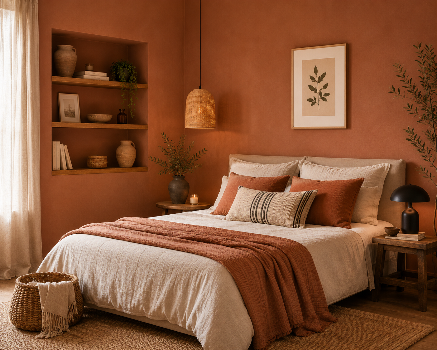
Photo 1 & 3 : AI-assisted photo renderings. Photo 2 : Realization made by Nathalie Cassan with Badisof Plus Marrakech. Matching Ocres de France : Badisof Plus lissé Costa Rica / Badisof Plus Marrakech (brossé ou lissé) / Badisof Terracotta
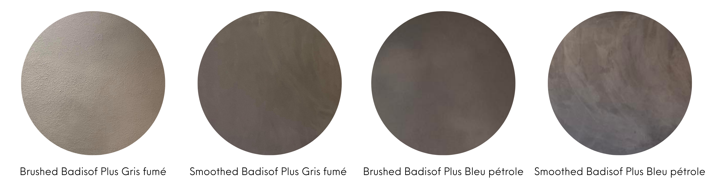
5- ... Anthracite Grey !
Sober and elegant, gris anthracite is the new black ! The neutrality of grey allows it to unite with all colors and atmospheres. However, be careful to bring touches of colors in decoration to brighten your interior. Outdoors, we love it passionately in flour painting : siding, shutters, garden shed, cottage… It will adapt to all your desires, can be lightened or darked. In addition to this neutral color, you can opt for very bright colors (mustard yellow, duck blue). Anthracite grey is also appreciated with touches of pastel colors such as…
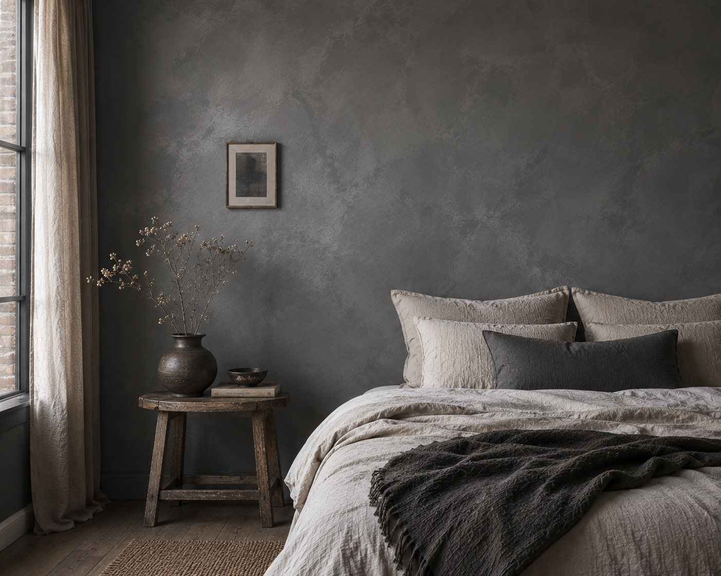
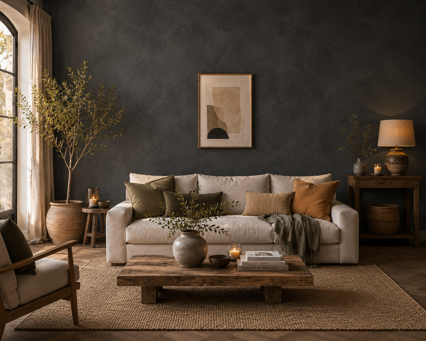
AI-assisted photo renderings. Matching Ocres de France : Badisof Plus Gris Fumé (brushed or smoothed) / Badisof Plus Bleu pétrole (brushed or smoothed)
6- ... Powder pink !
This shade is the modern, more beige version of the pastel pink, often considered “too girly”, “Malabar”… With its little sister, the powder pink, we find the perfect balance. It will bring the necessary touch of sweetness to your interior. In a living room, a bedroom, an entrance, it gives a touch of light and femininity. It blends perfectly with white and grey of course, but also with other more unexpected colors such as midnight blue, copper or…
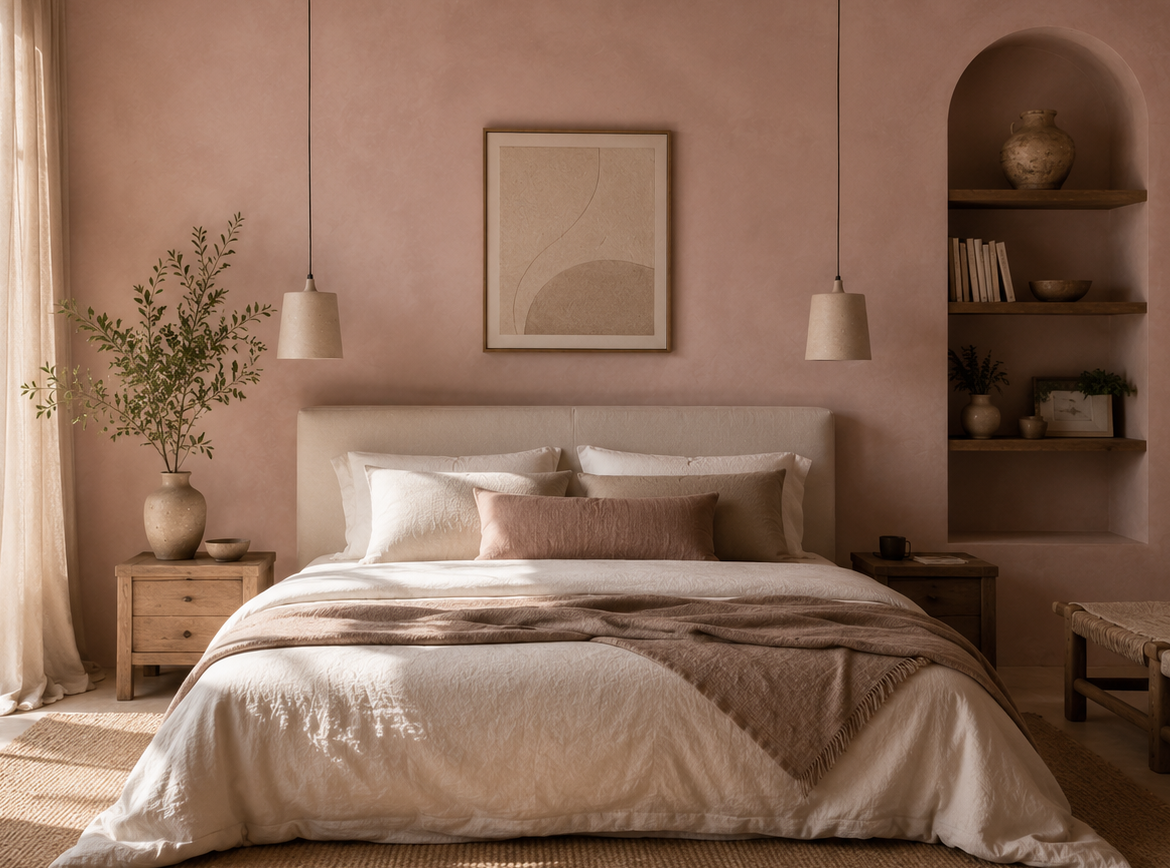
AI-assisted renderings. Matching Ocres de France : Smoothed Badisof Plus Coquille d'oeuf / Badisof Rose poudré / Badisof Vieux rose / Badisof Pêche / Badisof Tokyo / Badisof Pétale de rose
7- ... Green gray !
Mix of green and gray, this color can pull towards blue or sage green. Tender and soft, it preserves the sobriety of your room while remaining a neutral color. In a country house, it highlights the authentic charm of noble materials such as wood or rattan. It promotes sleep and finds its place perfectly in a room. We love it with a touch of powder pink, anthracite grey, cream… In flour paint, it will win your heart to enhance shutters on a cream facade and blends perfectly with the...
AI-assisted renderings. Matching Ocres de France : Badisof Vert sauge / Badisof Plus Vert sauge
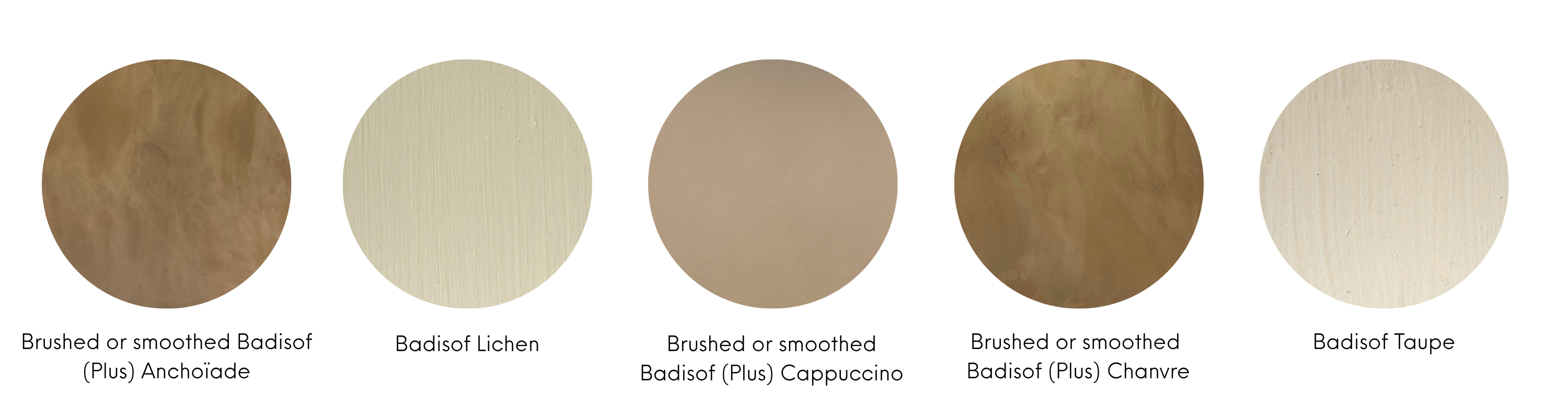
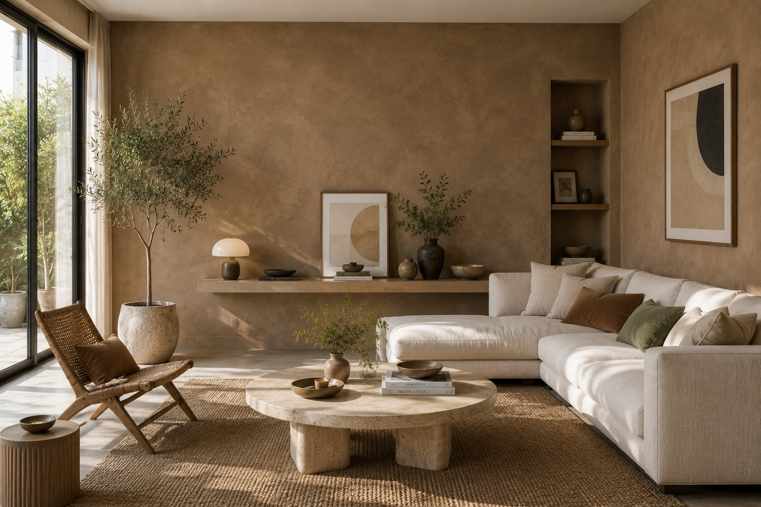
8- ... Clay earth !
More daring than a simple beige, it evokes nature, calls for calm and serenity while dressing a room without lack of taste. It will sublimate other pastel colors like green grey or powder pink or will brighten up brighter colors like terracotta. We like it in a dining room, a bedroom or a bathroom. And why not try to color Tadelakt in a bathroom with it ? In association with a sleek environment and wood/iron materials, it will emphasize the authenticity of this room sometimes less decorated but in which we spend a lot of time.
AI-assisted renderings. Matching Ocres de France : Badisof (Plus) Anchoïade (brushed or smoothed) / Badisof Lichen / Badisof (Plus) Cappuccino (brushed or smoothed) / Badisof (Plus) Chanvre (brushed or smoothed) / Badisof Taupe