
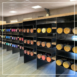

8 colors to (dare to) embrace in 2022
If you think you're already making the most of the benefits of spending time outdoors, think again. According to a survey conducted by YouGov, we spend around 90% of our time indoors ! While we don't always have the freedom to decorate our workplace to suit our tastes, most of us want our homes to reflect our personality and create an environment in which we feel comfortable and inspired. In fact, 26% of French people say they repaint their walls "very regularly". Yet, when faced with the endless range of colours available, the reassuring neutrality of white often wins out over bolder choices. We worry about getting tired of a colour, creating a contrast with our usual style, stepping outside our comfort zone... or simply choosing shades that don't work well together. But what if 2022 were the year to be a little more adventurous ? Let's discover 8 on-trend colours for this year and learn how to combine them beautifully in your home !
1- The Peacock blue
Colours are, above all, a matter of personal perception. We experience this regularly within the Ocres de France team : we don't always agree on what a colour should look like ! “But peacock blue must look at least a little like a mallard duck, right ?"* said the production team. And they do have a point. Depending on who you ask, peacock blue (or duck blue) can be a green tinted with blue or a blue tinted with green, lighter or darker. Everyone has their own interpretation. To meet the growing demand for this ever-popular shade, we created our own peacock blue limewash in 2021 (coming soon, we're working on it, we promise !). For a bright and soothing interior, pair it with white. It brings just the right amount of colour to enhance a living room, a modern kitchen, or a bedroom, while also adding depth and character to the space. We particularly love it in Scandinavian, graphic, retro-chic, and cosy interiors. And if you'd like to create a more vibrant atmosphere, we suggest combining it with touches of our second trending colour...
* In French, for peacock blue, we say "bleu canard" ("duck blue")
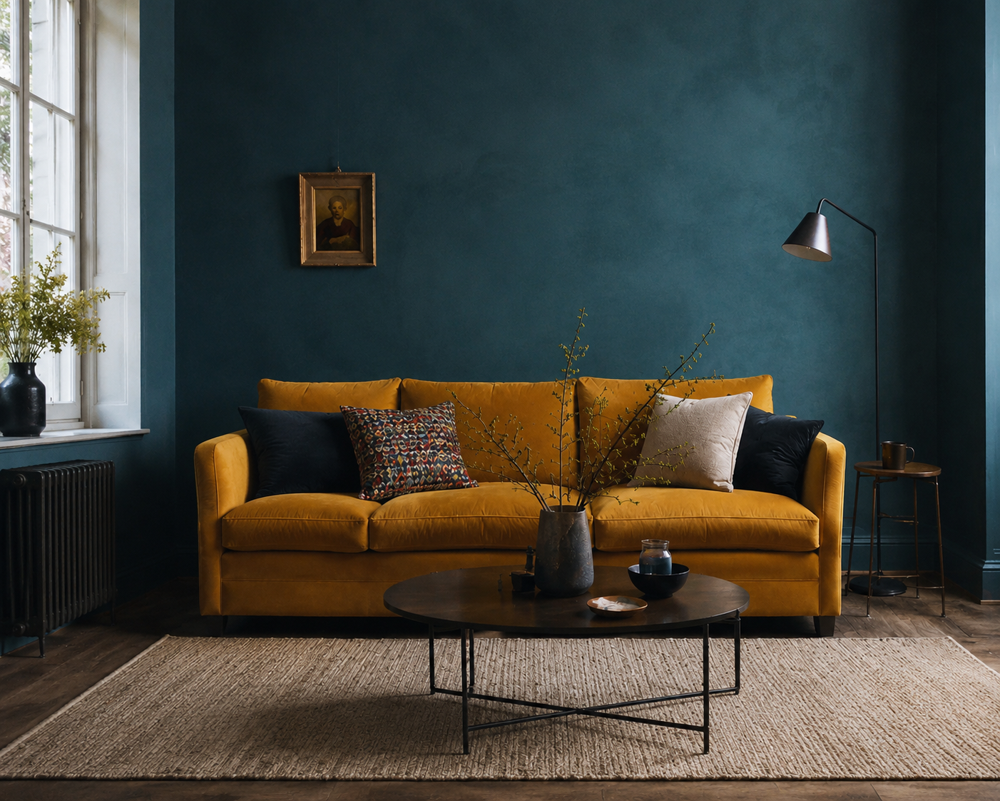
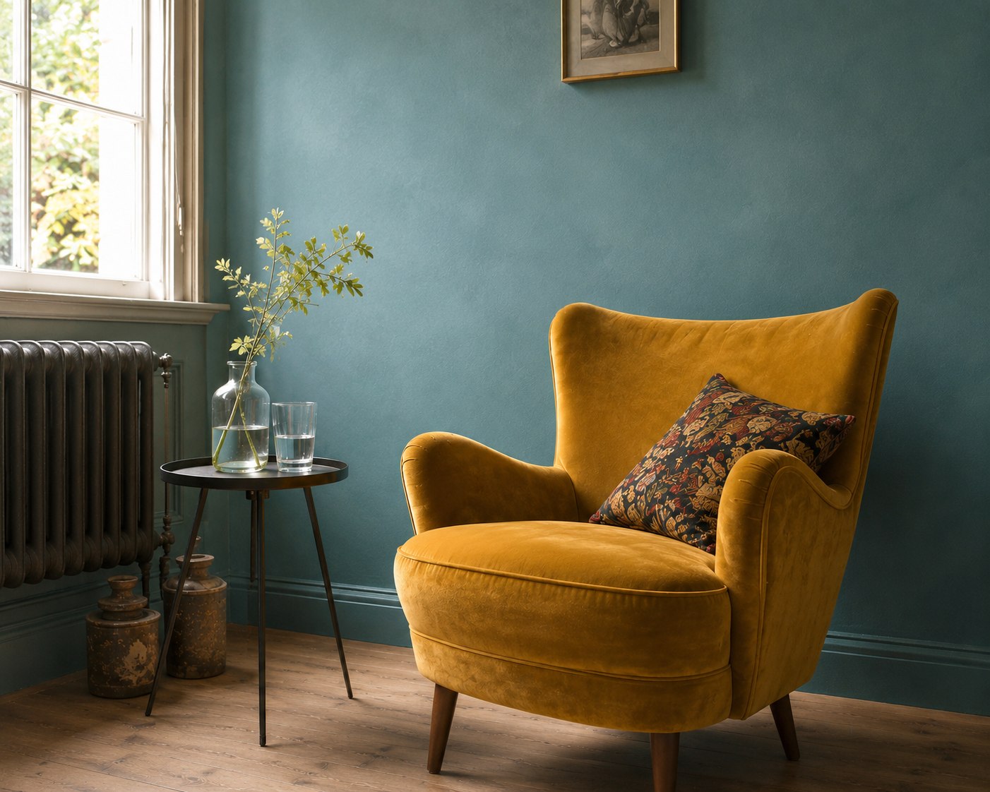
AI-assisted photo renderings. Pigment Bleu Canard Ocres de France / Lime paint Badisof Plus Bleu Lagon (smoothed)
2- ... Mustard yellow !
Indeed, yellow is blue's perfect companion. And we have to admit it: we're completely won over by this vibrant combination. As with any decorative scheme, the key lies in finding the right balance. Used thoughtfully, these colours create a lively and dynamic atmosphere without overwhelming the space. This pairing immediately brings Scandinavian interiors to mind. Bold at first glance, it works beautifully in a cosy living room with wooden flooring as well as in a sleek, modern kitchen. In a more industrial setting, mustard yellow can be paired with shades of grey or black for a striking effect. White, on the other hand, adds a sense of simplicity and elegance. In a contemporary, minimalist interior, mustard yellow provides just the right touch of warmth and energy to brighten the room. And if you're looking for a different shade of blue, something with a more exotic feel, why not pair it with...
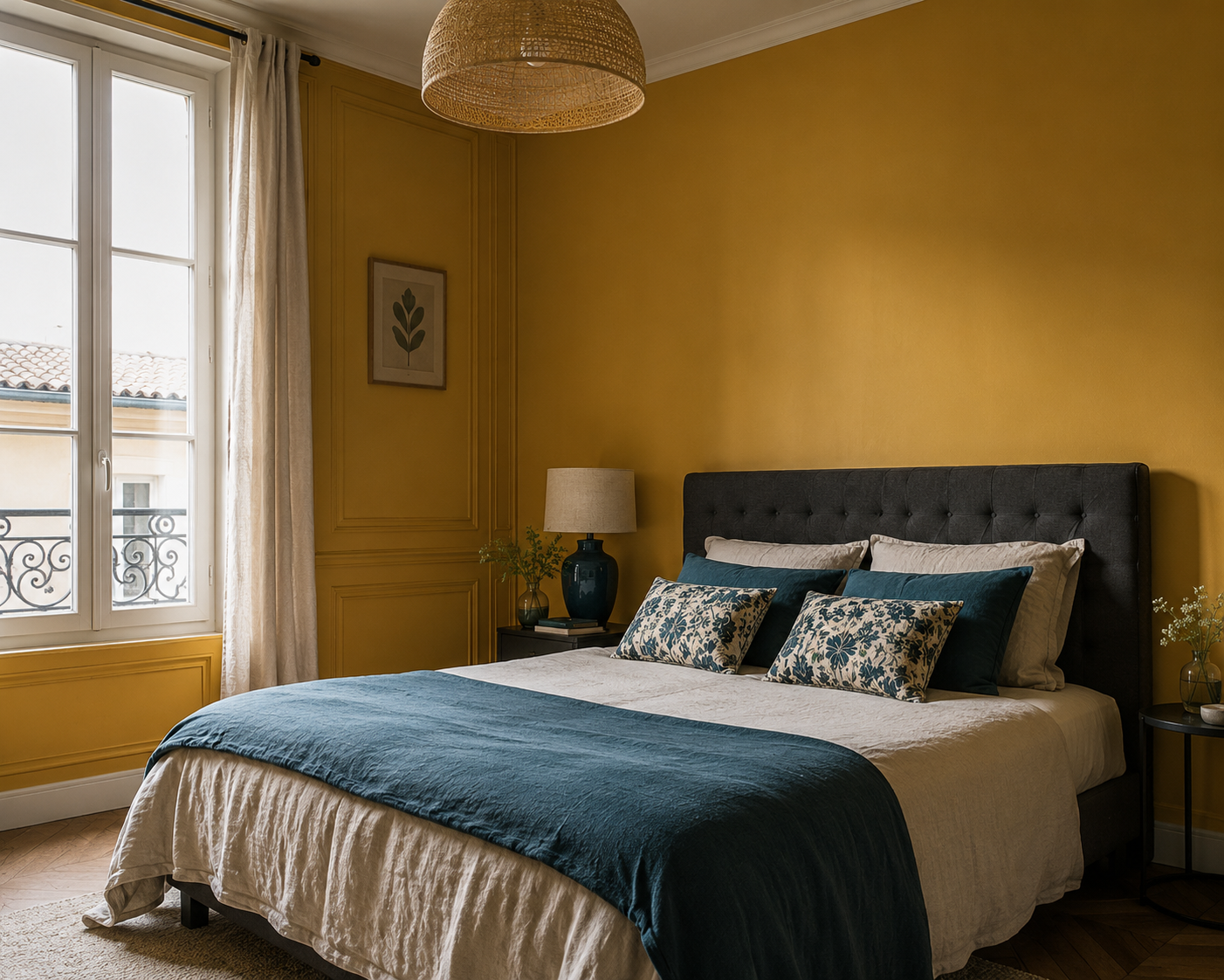
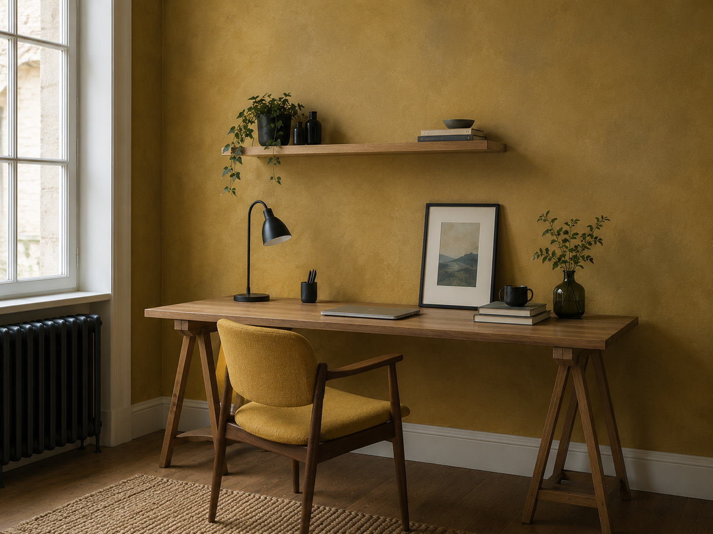
AI-assisted photo renderings. Pigment yellow Mustard to come / Yellow Mustard limewash to come
.JPG)
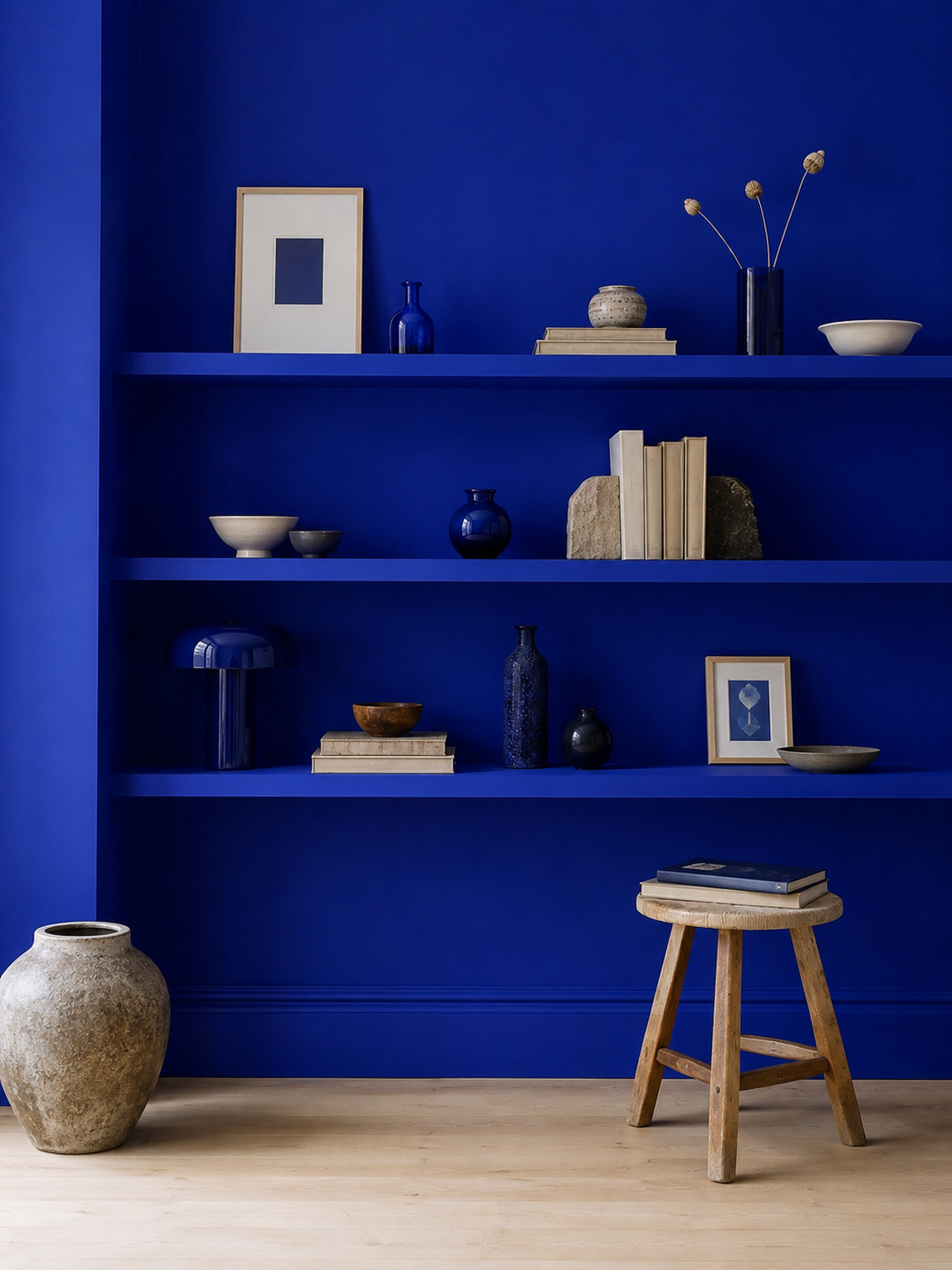
3- ... Ultramarine blue ! (Klein blue/Majorelle blue)
Timeless and captivating, Ultramarine blue (Bleu Outremer) appeals to anyone dreaming of faraway places and exotic destinations. We love it outdoors on shutters and front doors, as much as indoors in a bathroom inspired by traditional Moroccan hammams. Bright yet deep, this remarkable shade changes subtly throughout the day as the light shifts, creating different moods and atmospheres. Paired with yellow, it evokes an ethnic-chic or bohemian style full of warmth and personality. White, meanwhile, highlights its intensity and allows it to truly stand out on a feature wall. And for an interior inspired directly by Morocco, dare to combine it with...
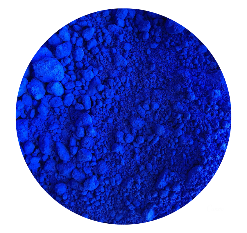
Photo 1 : Bleu Outremer in acrylic binder, work done by Pascal Peinture Déco with our pigment. Photo 2 : AI-assisted photo rendering
4- ... Terracotta !
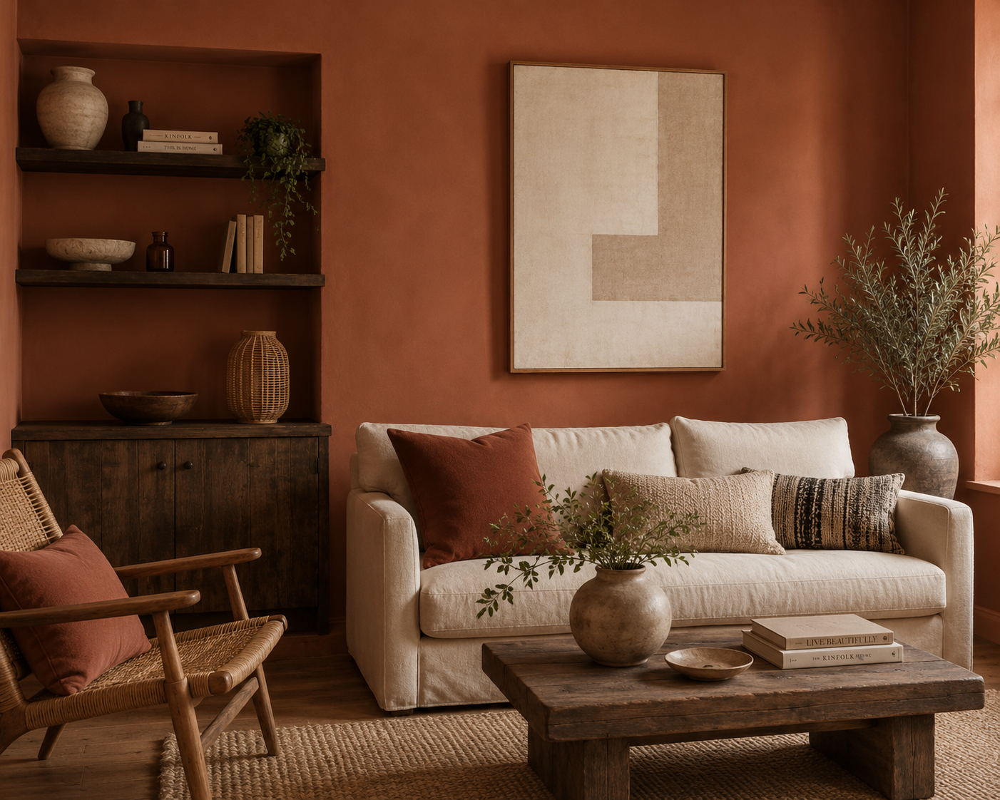
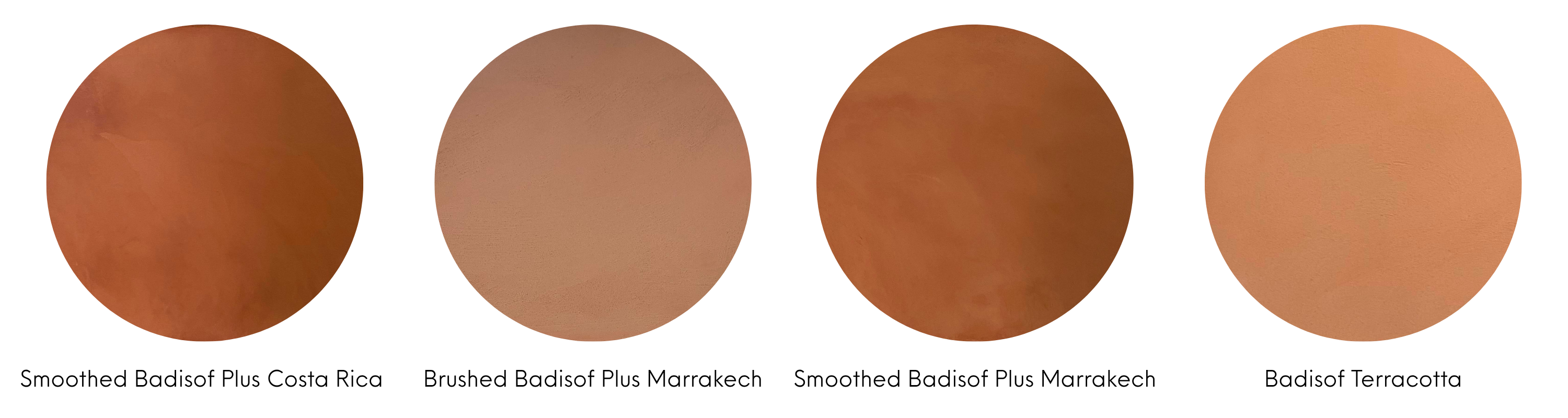
Another colour that is not so easy to define... The word "terracotta" comes from Italian and literally means "baked earth". Unsurprisingly, it therefore encompasses a wide range of shades, from red and orange to pink and brown undertones. We love it in bohemian interiors filled with natural wood and dried flowers -a style that has been particularly popular in recent years- but it also works beautifully in more contemporary or retro-inspired spaces. Terracotta instantly brings warmth and character to a room. It evokes cosy autumn evenings by the fire, wrapped in a soft blanket while winter settles outside. This inviting shade pairs perfectly with neutral colours such as white, beige, or...
.jpeg)
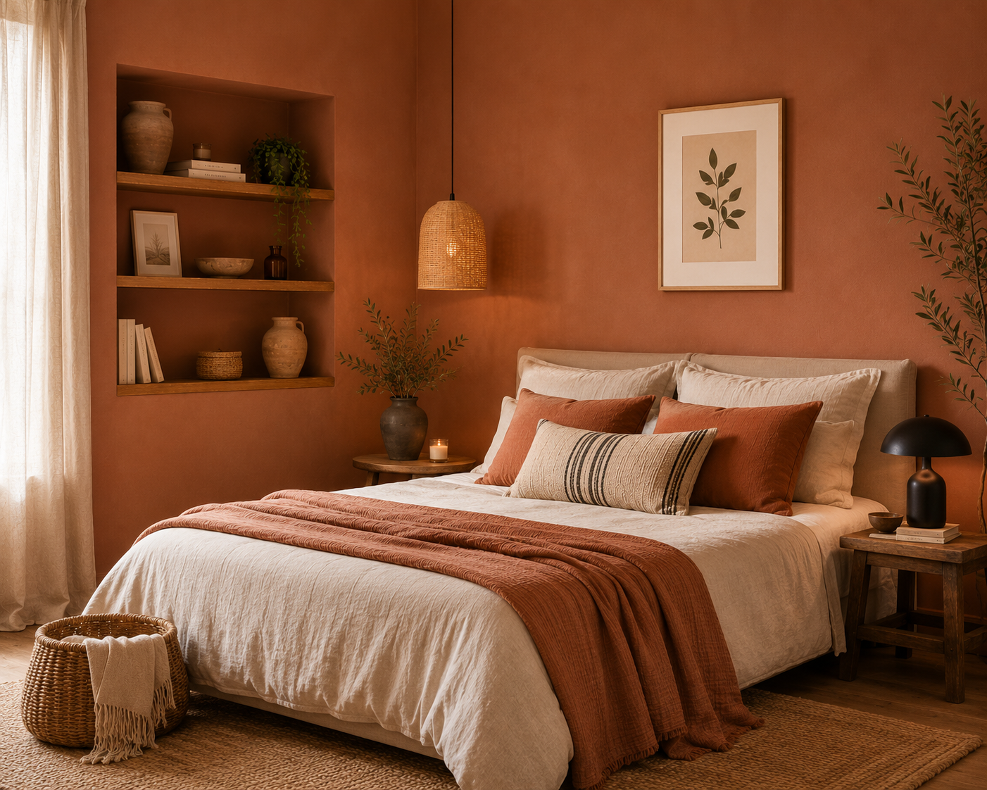
Photo 1 & 3 : AI-assisted photo renderings. Photo 2 : Realization made by Nathalie Cassan with Badisof Plus Marrakech. Matching Ocres de France : Badisof Plus lissé Costa Rica / Badisof Plus Marrakech (brossé ou lissé) / Badisof Terracotta
5- ... Anthracite Grey !
Elegant, understated, and timeless, anthracite grey is the new black ! Thanks to its neutrality, grey blends effortlessly with virtually any colour palette and decorating style. However, to avoid creating a space that feels too dark, we recommend adding touches of colour through furnishings and decorative accessories. Outdoors, we particularly love anthracite grey in traditional flour paint applications : cladding, shutters, garden sheds, cottages, and more. Versatile and adaptable, it can be lightened or darkened to suit your preferences. One of its greatest strengths is its ability to complement both bold and subtle colours. Pair it with vibrant shades such as mustard yellow or teal for a striking contemporary look. Anthracite grey also works beautifully alongside softer pastel tones such as...
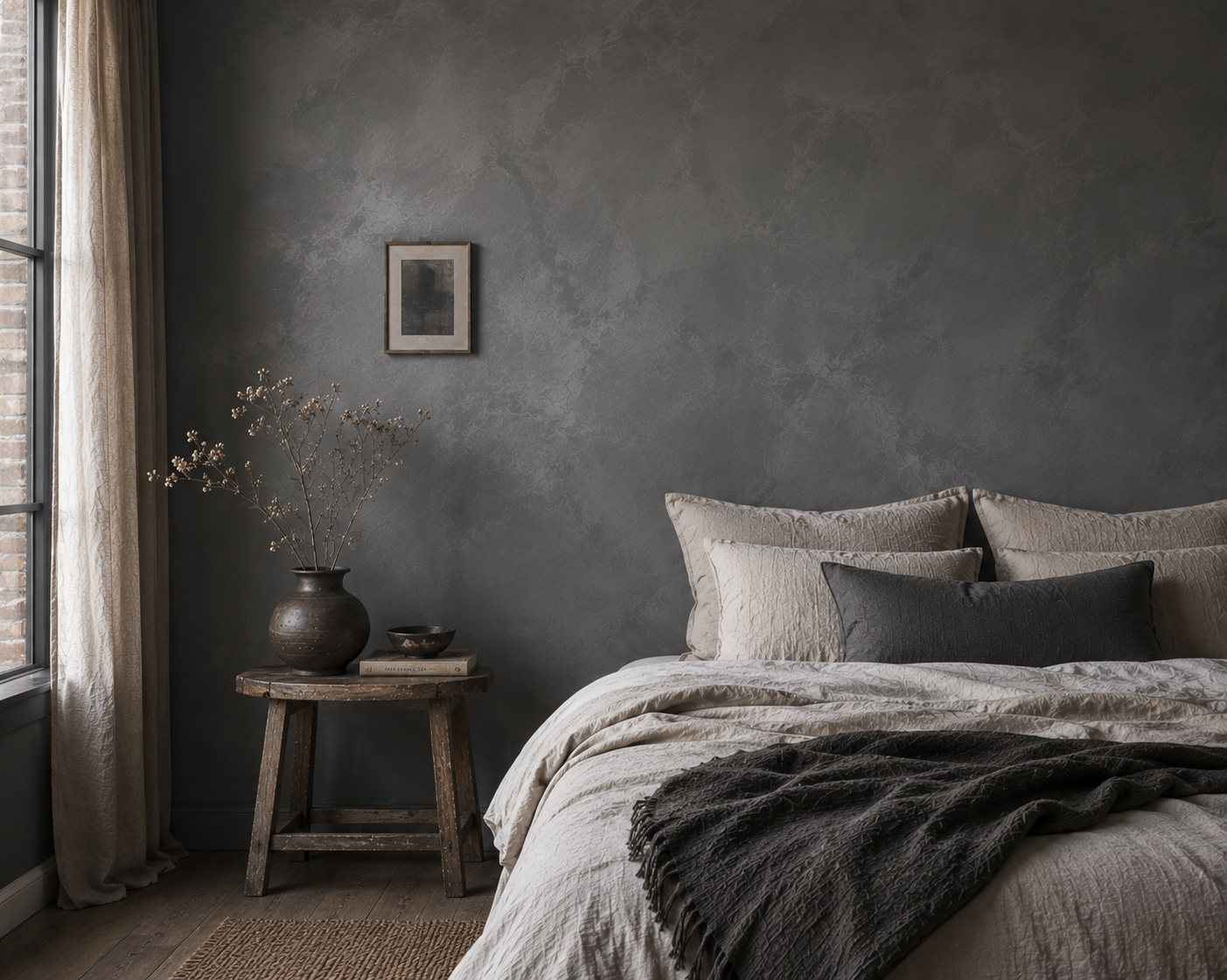
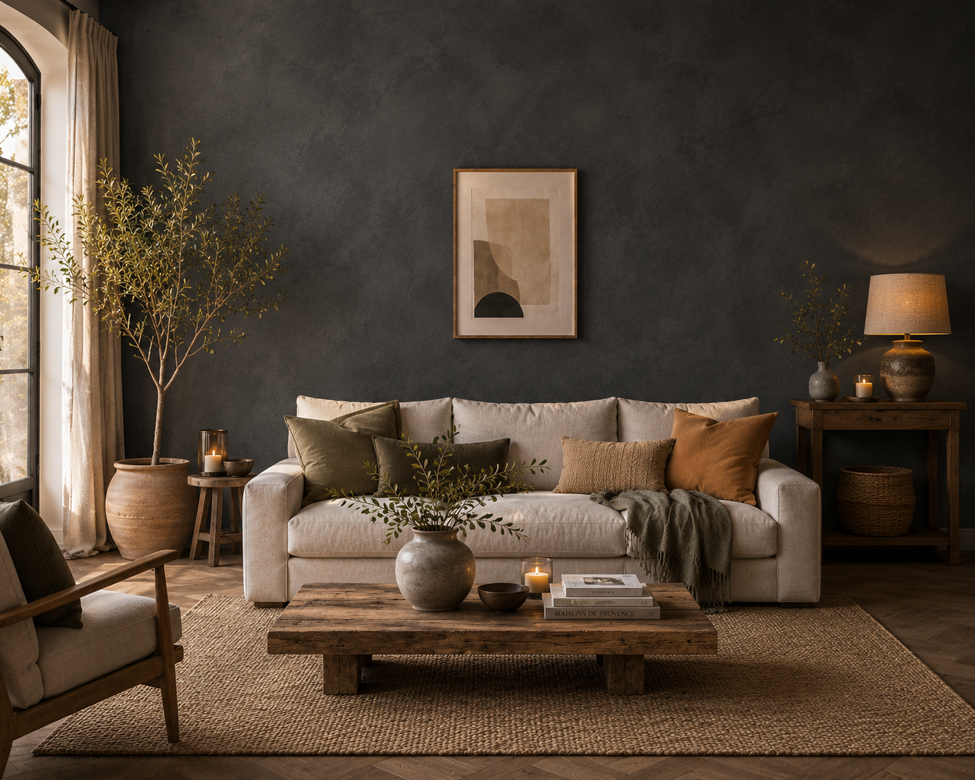
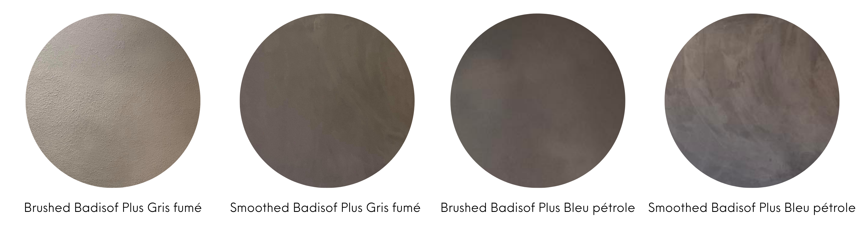
AI-assisted photo renderings. Matching Ocres de France : Badisof Plus Gris Fumé (brushed or smoothed) / Badisof Plus Bleu pétrole (brushed or smoothed)
6- ... Powder pink !
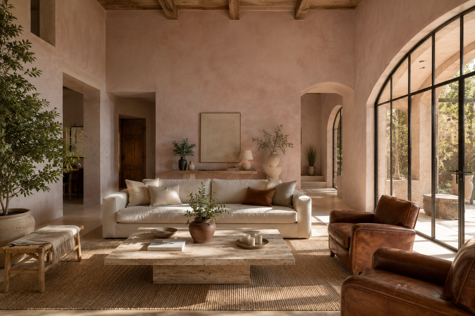
This shade is a more modern and sophisticated take on traditional pastel pink, which is sometimes considered a little too sweet or overly feminine. With powder pink, the balance is just right. Its subtle beige undertones make it softer, warmer, and easier to incorporate into a wide range of interiors. Whether used in a living room, bedroom, or entrance hall, it brings a sense of lightness, warmth, and elegance to the space. Of course, it pairs beautifully with white and grey, but it can also be combined with more unexpected colours for a striking effect. We particularly love it alongside midnight blue, copper, or...
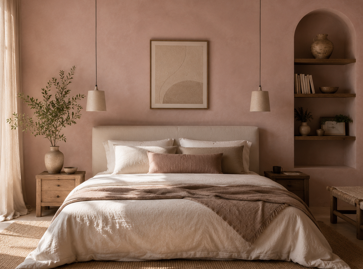
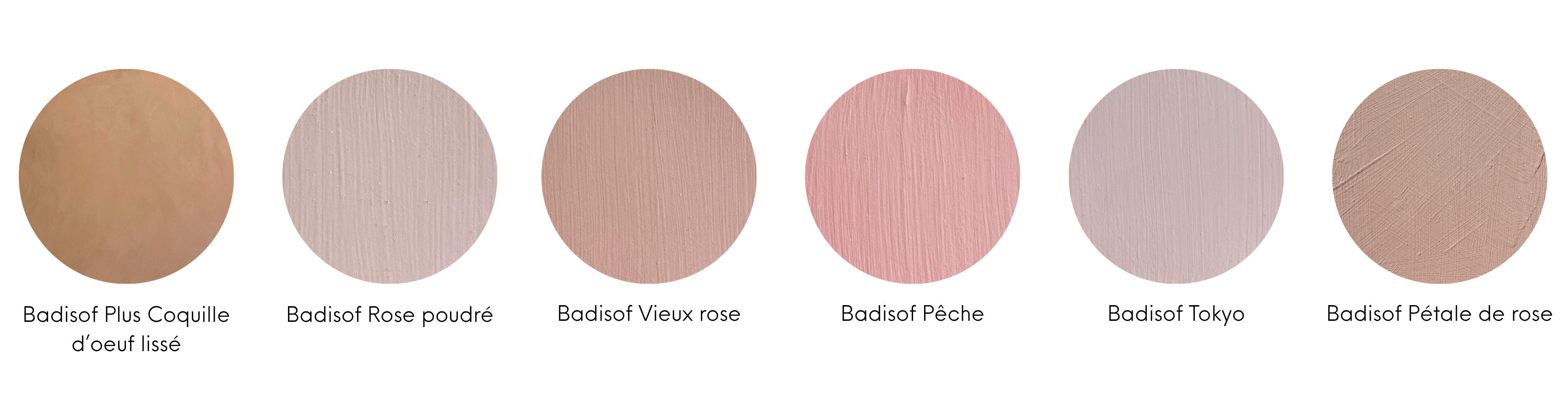
AI-assisted renderings. Matching Ocres de France : Smoothed Badisof Plus Coquille d'oeuf / Badisof Rose poudré / Badisof Vieux rose / Badisof Pêche / Badisof Tokyo / Badisof Pétale de rose
7- ... Grey-green !
A subtle blend of green and grey, grey-green can lean towards blue-grey or sage green depending on the shade. Soft and soothing, it adds colour while preserving the understated elegance of a neutral palette. In a country home, it beautifully highlights the authentic charm of natural materials such as wood and rattan. Its calming qualities also make it an excellent choice for a bedroom, where it helps create a peaceful and restful atmosphere. We love pairing it with touches of powder pink, anthracite grey, or soft cream tones. When used in traditional flour paint, grey-green works wonders on shutters, adding character and charm to a cream-coloured façade. It also pairs perfectly with...
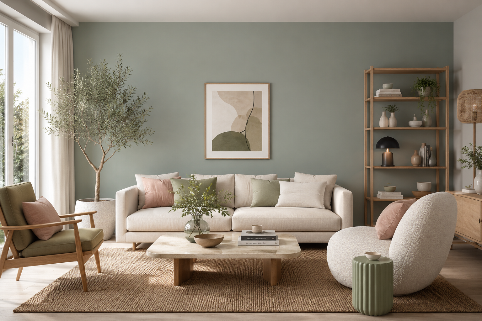
AI-assisted rendering. Matching Ocres de France : Badisof Vert sauge / Badisof Plus Vert sauge
8- ... Clay earth !
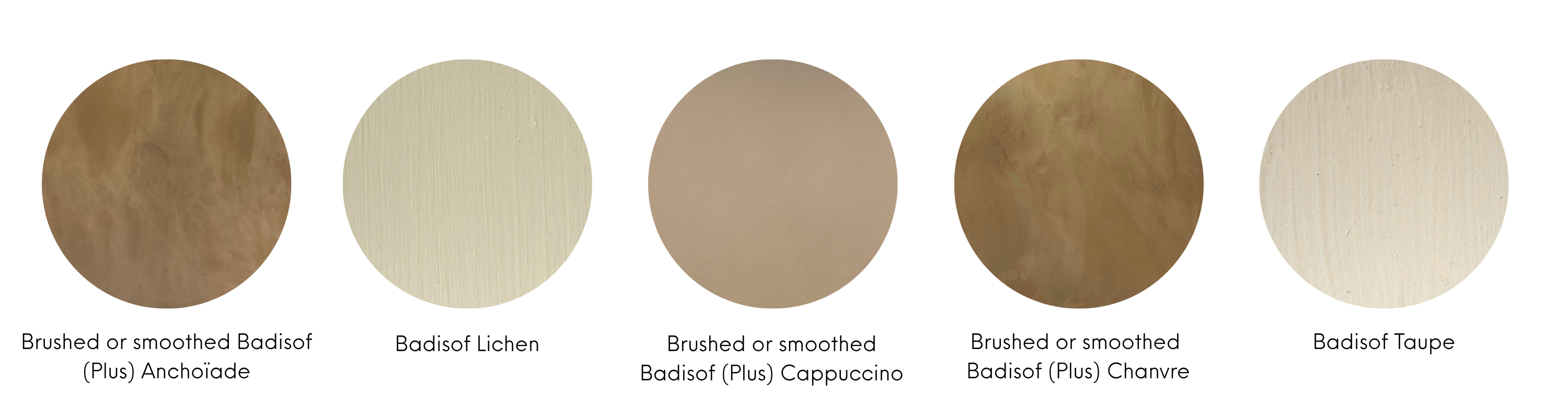
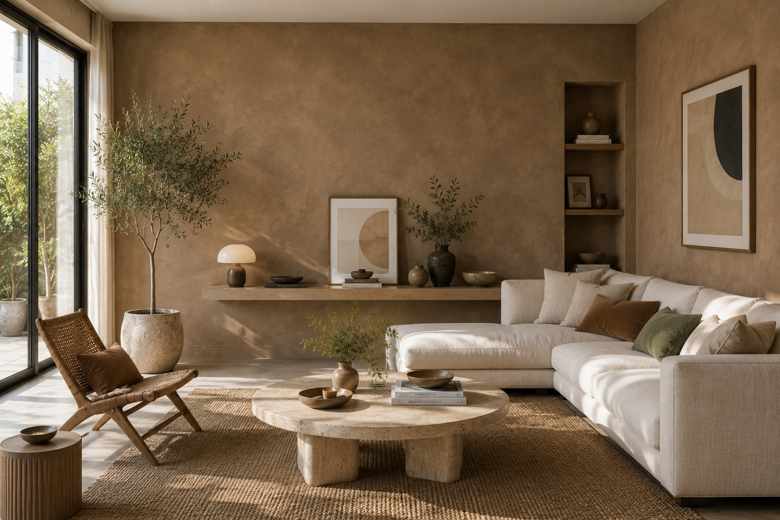
A bolder choice than a simple beige, Clay Earth evokes nature and creates a sense of calm and serenity while adding character to a room without ever feeling overpowering. It beautifully complements other soft, muted shades such as grey-green and powder pink, while also enhancing more vibrant colours like terracotta. We particularly love it in dining rooms, bedrooms, and bathrooms. And why not take it a step further with a Clay Earth-coloured Tadelakt in a bathroom ? Combined with a minimalist setting and natural materials such as wood and iron, this warm shade highlights the authenticity of a room that is often overlooked from a decorative perspective, despite being one of the spaces where we spend the most time.
AI-assisted rendering. Matching Ocres de France : Badisof (Plus) Anchoïade (brushed or smoothed) / Badisof Lichen / Badisof (Plus) Cappuccino (brushed or smoothed) / Badisof (Plus) Chanvre (brushed or smoothed) / Badisof Taupe
Ready to bring more colour into your life ?
Whether you prefer bold statement shades or soft, timeless tones, there's a colour out there waiting to transform your home. The most important thing is to choose colours that reflect your personality and make you feel good every day. So, are you ready to step outside your comfort zone and embrace colour ?